
Label Design: Tips, Tricks & Why It’s So Much More Than a Pretty Sticker
Label design isn’t always slapping your logo on a rectangle and calling it a day. Whether you’re creating something for store shelves, a warehouse workflow, or a regulatory body, that little label carries a lot of weight.
It might sell your product, explain how to use it, keep someone safe, or just keep the barcode scanner happy. In any case, it needs to do its job—and look good doing it.
Let’s break it down.
First Things First: Make It Look Good
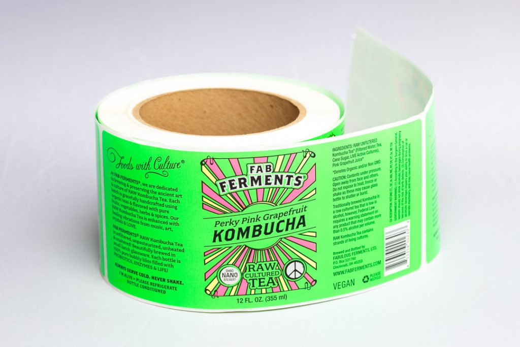
Humans are basically moths with credit cards (or clipboards), so your label needs to grab attention fast—whether it’s sitting on a store shelf or affixed to a pallet. Color plays a massive role here. Choose a palette that reflects the personality or purpose of your product.
Typography is equally important. Choose fonts that aren’t just beautiful, but readable—even at a glance. Finding that balance between flair and function is the goal. And finally, visuals matter. Custom illustrations, icons, and thoughtful layout structures aren’t just decorative—they help people understand what the label is communicating.
Psychology & Application: Emotional or Purposeful?
Some labels need to sell, others need to save lives. Understand what your label is trying to do and design for that.
For Product Labels:
- Consistency builds trust – Use a recurring style across all your products.
- Tell a story – Even a short line like “Made in our kitchen in Brooklyn” gives your product heart.
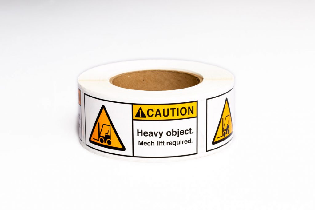
For Instructional, Compliance, or Safety Labels:
- Clarity is everything – Use standardized icons, color coding (think ANSI/OSHA), and clear language.
- Hierarchy of info – What’s the most important thing someone needs to see first? Make that the biggest and boldest.
Label Logic: Form Meets Function
When it comes to labels, readability should always be a priority. It’s also crucial that your label includes the right information in the right place. From ingredients and barcodes to lot numbers, expiration dates, and safety warnings, every element has its role.
Making the Art: Design Tips That Work for Everyone
If you’re working in design software, here are some must-knows:
- Set up the file correctly – Use the exact label dimensions and include bleed and safe zones.
- CMYK, not RGB – Design in CMYK. CMYK is for print; RGB is for screens.
- Vector = clean print – Logos and graphics should be in vector format for sharp results.
- Outline fonts – This prevents font issues when your file is opened on another computer.
Sending Us Your Artwork
When it’s time to send us your label design, the cleaner the file, the smoother the process. We recommend using Adobe Illustrator (.ai) or a high-resolution PDF format. These preserve vector quality and ensure your fonts and images stay sharp when scaled or edited. Screenshots and low-res images are difficult to work with because they often lose clarity during resizing and prep. It’s also important to make sure your file isn’t locked.
Upon receiving your artwork, we will send you a proof ensure that we are printing exactly what you want.
Is design software not your thing? No worries—we can handle it. Just send us a sketch, a mood board, or a detailed description of your vision.
Whether it’s selling a candle or explaining how to safely operate industrial equipment, your label is working overtime. It introduces you. It guides, informs, and protects. So make it stand out!
Because in a sea of products, pallets, and parts—you don’t just want to be seen.
You want to be understood.


